Typesetting the net - font embedding

23. sep 2000 For a very low cost of 5-10 k fontembedding gives the possibility of getting typographic identity for a whole website – allthough with a litte trouble.

23. sep 2000// typography /web //
The frustration about missing typographic tools for web design might be well aknowledged. How do I make typography in a graphically sense for the web. Cascading stylesheets offers an extensive typographic control such as fontsize, lineheight and letterspacing. However, cascading stylesheets doesn’t offer a solution to the missing font problem.
The available fonts are limited to the fonts that are widely installed on the computers, that is, you know, such as Arial, Helvetica, Verdana, Times and Georgia. Some of them are even very legible on screen and thus very usefull for webdesign. Others may be preferred, because the users are familiar with them and therefore able to actual read the squiggles. But it’s hard to get a unique typographic identity with that few fonts in the stock.
Anyway, you don’t have to surf the web for a long time to find that there are many welldone typographics out there. Typically logos, headings, menuitems, and sometime even whole webpages are converted to images. As an immediate advance you get control over the proportions of the page (apparentlyat least), and, first of all, it doesn’t matter if the user doesn’t have the font installed. And beyond that limitation, you can do the design, typographic design, as we know from magazines and ads. There are drawbacks, yes, and we have gotten used to them through the years, but they shouldn’t be rejected just like that:
  • Pour print quality
  • Text can't be edited
  • Text is not scalable

The answer to these problems is to use vectorbased fontdescriptions rather that the bitmap conversions. And then to use a format within which the text remains editable as text – though not necessarly editable directly in HTML, but at least in a texteditor. With the standards of today, this means either SVG or embedded fonts.
The main technical objection to SVG is, that it demands a plug-in for the browser, and that it has a unflexible bounding box. If you want to know more about SVG, Adobe’s website is a good starting point.
Font-embedding can be used right away, or: the newest browsers understand and show embedded fonts. You just have to accept, that older versions don't show the right fonts, or that the user might have turned the »allow page to specify fonts« off. These users will still be able to see (and even read) the text, though not in the right dressing.
ufReguleBold embedding
If necessary, get the SVG-viewer:
Three way to get the font transferred to the users computer:
The filesize does't differ much, weather this text is made as an bitmapimage (here gif), vectorgraphic (svg) or fontembedding (which is vector as well). But the gif-file suffers when printed or enlarged – actually, it can’t be enlarged by the browser at all.
The font embedding file can be used for all text on the whole website, it only has to be downloaded once to the browser’s cache. kan bruges til al tekst på en hel website og skal kun downloades en gang til browserens cache. The text is – as any HTML-text what so ever – editable is you usually HTML editing tool.
The SVG file can be opened in a ordinary text editor and changed just like that. The actual font description you better leave unchanged, but the other parameters are easy to recognize, and at least the concrete text easily changed (given that the new glyph descriptions allready are embedded in the file).
Take a look at the svg-file source here.

The font description, among other the vector curves of each glyph, is generated with a small application, and written to a file that can be linked to the HTML- or stylesheet dokcument. The filesize depends on the design and how many glyphs to be be included. A simple design and about 100 of the most used glyphs (that is capitals, minuscles, nummerals, and punctuations) will take no more than maybe 5-8 kilobytes. And that's all it takes to make a typographical identity for a whole website.
Unfortunately, and typical for the web, we suffer from competing standards. Today there is no standard that covers the whole market. Bitstream’s PFR-format (portable font resource) is the closest, and the application for this format, Webfontmaker, is possibly the easiest to use. The format can be used for both Explorer and Navigator, but not for Explorer for Macintosh, because Explorer need an Active-X component that's not available for Mac. Microsoft’s application WEFT generates an EOT-format (embedded open type), that only is interpreted in Explorer, but then both on Macintosh and Windows.
The eot-file is being used by Microsoft Internet Explorer (right), the pfr-file by Netscape Navigator (left). Explorer for Windows can be made to interpret the pfr-file, but as the antialiasing is better with the eot-file, you should use this for both Macintosh and Windows. You don’t even have to take any precaution, since the HTML don’t get screwed up with links for both of them in the same document.

Do we then have this wellknown trouble, that we have to make browserdependent versions of the websites? Well, it's not that bad after all. If you really want to keep things separate it can be done, though. Dynamcal websites are allready based on queries, you just have to add an extra question about the browser type. And on static websites it can be done by a simple javascript.
But it's really not necessary, because you might as well link to both font-files in the same document, because the browser will ignore the useless code. Thus there’s no reason to actually use the Active-X component that enables Explorer for Windows to understand the PFR-files. The only must is that the font is named the same in the two font-files. And that could be a problem, especially if you have Webfontmaker for Macintosh and WEFT (which is only) for Windows, because the naming differs on the two platforms. More serious is the expense, because you have to have the font installed on both platforms in order to generate the pfr- og eot-filerne – it's hardly the standard fonts that you want to use for font embedding. To avoid buying both version of the font, you may use the application TransType from FontLab for 50 US$ (and this is not a discussion about the licensing problem now).

<html>
<head>
<link rel=fontdef src="thefont.pfr">
<style type="text/css">
@font-face {
font-family: thefont;
font-style: normal;
font-weight: normal;
src: url("thefont.eot")
}
p {
font-family: thefont, verdana, sans serif;
font-size: 11px;
line-height: 15px;
color: black;
}
</style>
</head>
<body>
<p>
This text is set with the font "thefont".
</p>
</body>
</html>
The code you need in your HTML document to have the font »thefont« embedded.
The red codes are what you need for the pfr-file and eot-file respectively.
The grey code is the needed CSS, to make the <p> tagged text appear with the font (in this case black, 11px/15px thefont).
No need to write this down. Get the HTML-source here.
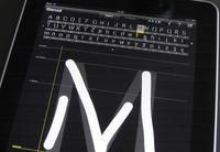
0
Typo-offended

Typo-offended

»Do You by any chance remember: In which font did you scream?«

More web sites for the danish authorities are using webfonts

5. DEC 2013 //
But far the most of them still don’t! Only 22 out of 122 web sites for the danish authorities. And the majority of those are prefering free fonts. On the other hand is the number more than doubled in a year, since November 2012 when the number was 9 out of 115.
The study is a snapshot that I took November 6, 2013 and covers the […]
3D enlightening Copenhagen

3D enlightening Copenhagen

20. JAN 2011 // berlin
After visiting Buchstabenmuseum in the fall 2010, I started to register this applied typography in big scale in Copenhagen. Big letters, neon, and stuff.
As far as I remembered, this was different from how it was back in Copenhagen. Consequently I started to look around here, and of course there were many more than I expected. […]
Fingerpainted fontdesign

Fingerpainted fontdesign

12. MAJ 2011 // typografi /ipad
Take a few hours with iFontMaker on the iPad and tap, tap, draw, drag, pinch through the alphabet. And you may end up with a truetype font that you can write with on any computer, whenever the font is installed.
Welt aus Schrift, type exhibition in Berlin

Welt aus Schrift, type exhibition in Berlin

12. NOV 2010 // design /typografi /berlin
Posters, books, jugend, bauhaus and de stijl ... via swiss to decon. The Welt Aus Schrift exhibition in Berlin is beauty in the literal sense of the letter. Do take a visit!
Big Letters Light

Big Letters Light

Buchstabenmuseum Berlin. Why are these letters so attractive? I don't get an answer at Buchstabenmuseum, but I most certainly get a wish to look after all these servants of the announcements, sofisticated as well as monumental.
Bridges and letters in Amsterdam

Bridges and letters in Amsterdam

Round the city of Amsterdam, crossing the grachten - many of the bridges have their names displayed with ‘De Amsterdamse Brugletters’.

TypoMov

13. APR 2001 // animation /typografi
The spoken information on the other hand is dynamic with an absolute demand of presence. If you're not there, you'll miss it, because the spoken word disappears instantly. The meaning of the spoken information may be stored in your memory, but the words are gone.
TypoMov is a brief presentation of the main points of a lecture […]
Fontc[art] Generator

Fontc[art] Generator

20. OKT 2001 // javascript /random /typografi
Everything that can’t be automated is design.
At the ATypI conference in Copenhagen 2001 Erik van Blokland, Letterror, made the statement that design is not to make one or more possible solutions of a certain task. Design is rather choosing the right one among all these possibilities. And since the making of the examples […]
ATypI Copenhagen dynamisk logo

ATypI Copenhagen logo

We had the napkin with the notes from the galla dinner at ATypI in Leipzig 2000, Henrik Birkvig and I on the flight back to Copenhagen, and we knew that we, together with Kim Pedersen, were about to organize ATypI in Copenhagen the year after. And already then we sketched the cliches for identity of the conference: Red-white, old-new […]
It looks like a mail from the agriculture association, but it might as well be phishing

It looks like a mail from the agriculture association, but it might as well be phishing

If I buy something on, say, sales.com, the response mail should come from sales.com and all links within the mail should be to sales.com. Anything else looks as a phishing attempt, and it might as well be.
iSticks and iSkins

iSticks and iSkins

13. DEC 2010 // ipad /mobilt web /offentligt rum
The danish boulevard newspaper, Ekstra Bladet, has decided to campaign for the freedom of speech – seen as the freedom of nudity. The danish MEP, Morten Messerschmidt is supporting by taking the discussion into the European Parliament.
Seven clicks towards Mobile First

Seven clicks towards Mobile First

The net is flooded with apps - for smartphones and tablets. But web sites are still better viewed on a computer, right? So the marketing department is happy and web design is business as usual. Maybe because apps and web sites are considered as two different things, rather than two versions of the same.
You may create coherence […]

Technical enthusiasm, please

1. SEP 2000 // web
Usability and accessibility on the net becomes more and more equal to unlimited choices and professionalizing of the user, who thus will be the responsible to be able to get the information from the websites.
You may say I am puritan. On the other hand, when I shuffle the web, I may too say that I have the right to be puritan. […]
Your website is (almost) an app

Your website is (almost) an app

14. DEC 2010 // reklame /ipad /web /mobilt web /mobilism /web apps
I must admit, it’s (still) cool to have my icon right there on the iPad screen. As an app, yes, but a website can also do the trick. And website based app may sometimes even be a better solution than a native app.

The user rules

1. MAJ 2000 // design /web
Usability and accessibilty on the web becomes synonymous with free choice and professionalizing of the user. Thus, she is more and less self responsible for being able to recieve the information of the websites.
The computer is putting still greater demands to the user, but despite of that it is easier to use today than ever. […]

Freedom through constraint

10. OKT 2001 // web
The postman is somewhat special. He brings all sorts of things. Postcards from Jamaica. Bills, too, unfortunately, but it’s not his fault, after all.
home.pages - preface - june 1997 The postman is somewhat special. He brings all sorts of things. Postcards from Jamaica. Bills, too, unfortunately, but it’s not his fault, […]
Web design, home pages for starters

Web design, home pages for starters

1. SEP 2001 // design /web
To the puritan any design that make any demands, will be noise. But you may as well take the opposite stand, that the purely textbased information is reserved for the skillede readers.
Torben Wilhelmsen, Thomas Green and Geert Sander Published first time in 1997. The book was one the selected Books of the Year in 1998 in Denmark. […]