 TypoMov is a brief presentation of the main points of a lecture I did at the Hague ATypI-conference in november 1996. Maybe this is more understandable than the original lecture…
Information becomes static when written or printed. This is obviously advantageous because a huge amount of information can be stored extracerebrally, no matter if it's analogue or digital.
The spoken information on the other hand is dynamic with an absolute demand of presence. If you’re not there, you’ll miss it, because the spoken word disappears instantly. The meaning of the spoken information may be stored in your memory, but the words are gone.
Now, with digital media you can combine these types of information and get dynamic text.
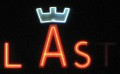
once a director-movie: Light-sign
TypoMov is a brief presentation of the main points of a lecture I did at the Hague ATypI-conference in november 1996. Maybe this is more understandable than the original lecture…
Information becomes static when written or printed. This is obviously advantageous because a huge amount of information can be stored extracerebrally, no matter if it's analogue or digital.
The spoken information on the other hand is dynamic with an absolute demand of presence. If you’re not there, you’ll miss it, because the spoken word disappears instantly. The meaning of the spoken information may be stored in your memory, but the words are gone.
Now, with digital media you can combine these types of information and get dynamic text.
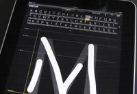
once a director-movie: Light-signIn ufLightSign you may experience how it feels to write a text that acts like the spoken word: When written the words disappear almost instantly. once a director-movie: ufFeet mov
In ufFeetMovie the content seems to be some kind of dance. Actually it’s a coded text, and in this case it’s not the letters that move. Each letter is a foot position and showing them on a timeline instead of a baseline, you get a stroposcobic movement. (Feet is available as a font, too: ufFeet) In the real world the text wouldn’t survive this kind of typography. We must hold the dynamics tight. But it can be used as an extra effect, an extra style. I’m used to judging a font upon whether it has small caps and old styles figures or not. Now the typedesigner must face a new challenge: mobility.
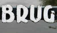
On a fence in Berlin somebody had sprayed the words bekleben verboten using a stencil, repeating it many times. All the letters were different depending on the structure of the wood and the amount and pressure of the paint. I took 20 photos and created the missing letters out of the form and structure of the few letters on the fence. As many as 12 versions of each letter were put together in filmloops. Thus I made a new style for Just van Rossum’s ffKarton, allthough I chose to let it be an independent font, named ufKartoon In ufKartoonMov you can write with the font. 80 K


![Fontc[art] Generator](https://data.wil.dk/_images/_base/2009/200/theskrift_lowcrop.jpg)