3D enlightening Copenhagen
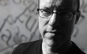
20. jan 2011 After visiting Buchstabenmuseum in the fall 2010, I started to register this applied typography in big scale in Copenhagen. Big letters, neon, and stuff.
As far as I remembered, this was different from how it was back in Copenhagen. Consequently I started to look around here, and of course there were many more than I expected. That's how it works when you start looking and pay attention to these subversive elements.
On the other hand, there were not many, that I really wanted to collect.
Here's a few, just as examples, which I would like to - not necessarily take home and install in my living room - but at least remember, and not the least enjoy when I pass them on my way through the city.
14
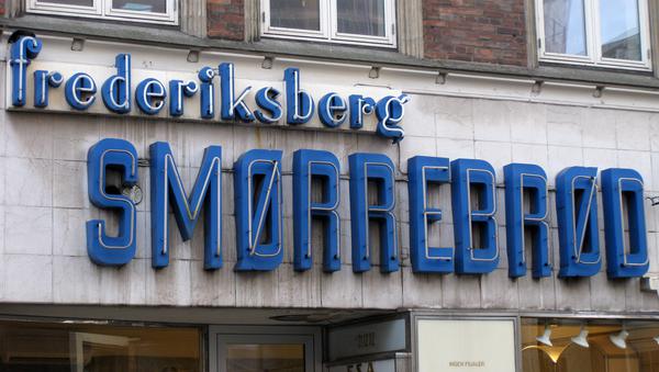
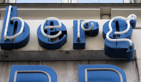
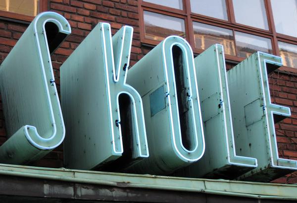
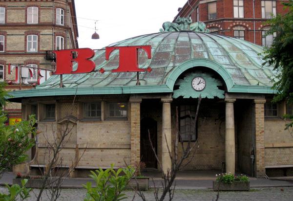
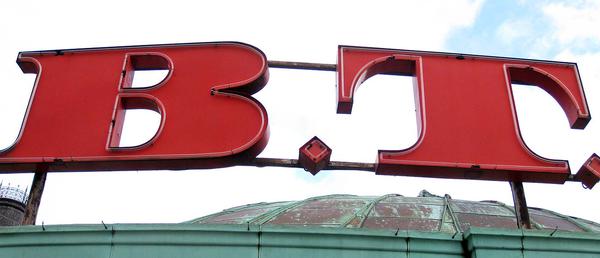
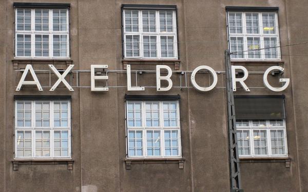
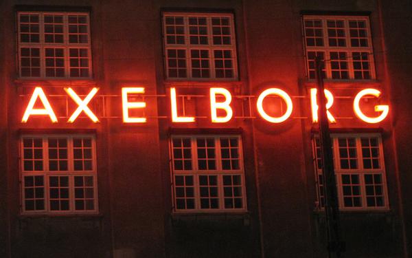
24. juni 2012: I the spring 2012 the front was redesigned, and the blue and extraordinary letters (though the neon didn‘t work anymore) were removed in favor of flat, dark brown letters – in Futura Black Italic ... such a shame!
501
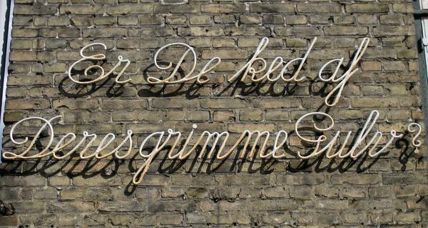
Are You tired of Your ugly floor? And it's not a question is the floor is ugly at all. The company closed (or moved) in 2010, but the apparently rhetorical question is still standing.
501
501
501
Here you need a little more than a piece of silk paper to adjust the spacing.
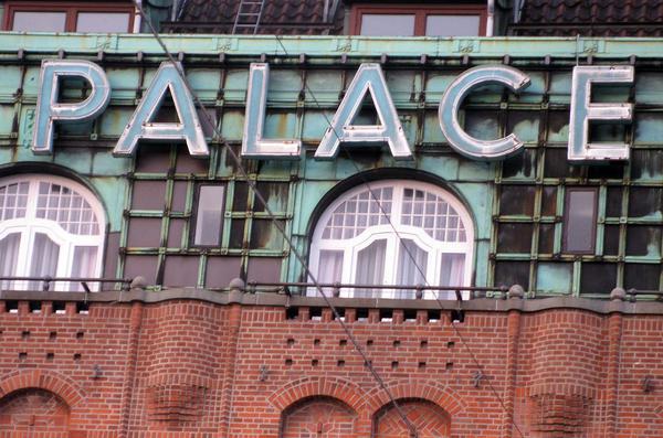
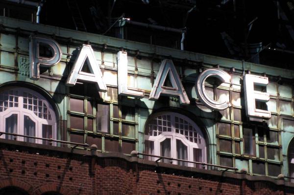
The neon is not lightned at dark. But the spotlights illuminates the letters in a dramatic way. Is this the place you would stay overnight?
501
Big Letters Light ➜
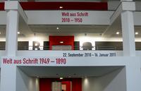
Buchstabenmuseum Berlin. Why are these letters so attractive? I don't get an answer at Buchstabenmuseum, but I most certainly get a wish to look after all these servants of the announcements, sofisticated as well as monumental.