home.pages - preface - june 1997
The postman is somewhat special. He brings all sorts of things. Postcards from Jamaica. Bills, too, unfortunately, but it’s not his fault, after all. He also brings software as mailorder. You can pay with creditcard, even cash and get change. Or, if you’re not at home, he leaves a note, so you can get the stuff at the postoffice. And then he’s able to tell – you don’t even need to push his buttons – how much postage for a letter for Bhutan. It’s all very interactive.
But after all, you probably never took him for a medium, neither spiritual nor physically.
Neither is the Internet a medium. Like the postal services it’s a worldwide transmission net, and the major advantage is a huge amount of data connected digitally. That gives the opportunity to link references and to seek and find new information that is immediately accessible.
The data are not better quality on the Internet. On the contrary: Images and sounds are often bad, and the text is hardly legible. Actually we would rather distribute the digital advantage as hardcopy!
The medium is the web pages placed all over the world on computers, that you acces via the Internet. In contradiction to the mail that is brought to your adress, you literally have to go and get the web pages yourself. And the kilos slow you down, the heavier stuff, the slower you go. So slow that you maybe drop the newspaper on your way home. Well, that’s a restriction – for the publisher. And it’s a challenge.
Transmission
The transmission time is no new phenomenon. It takes some time to get the magazine from the printer to the readers. You have to think of the weight, too, because of the postage rates. But the time was not under your influence.
On the Internet the transmission is dreadfully visible, and the transmission time is highly related to the weight – how many kilobytes takes the web page. To the designer this is quite a new aspect. One page in a magazine may take 50 megabytes. As a web page the same content shouldn’t exceed 50 kilobytes, and that’s quite a drastic reduction in the size of the digital data.
The challenge is to keep the size below the acceptable limit for web transmission. That’s the constraint the designer have to live with. He may build in a functionality that can’t be done in a magazine, with links, animation, sound and someday even video, multimedia-action... It offers a creative freedom that counts several kilobytes.
The design on the other hand, has the same purpose as ever, that is to make the information comprehensible. To help and be a part of the communication.
The less that is necessary
Web pages should contain everything that is necessary to communicate. But what seems to add value at a first sight may as well do the opposite, because the speed of the transmission is slowed out of existence. The big job is to define the necessarity. So why not evade that and construct the web site in a way that gives the user the choice of sparing the bytes, without giving the feeling of missing the point.
You can’t remove enough bytes from the quality of the printed matter and get a well performanced corresponding web site. You’ll rather end up being disappointed about the lack of possibilities and regret the reduced image quality.
You’ll better start from nothing, zero bytes, and then consider the less that is necessary to communicate. You’ll often find it easier to accept to add some extra kilobytes than to take the megabytes out of the paper images. The extra kilobytes may be a visible improvement, the latter can be a disastrous downer.
Web design is structurally far from the magazine or a leaflet. The graphical ideom may be the same, but the tools are different. And you’ll be better of arguing with communication purposes than with any subtle design.
Not just usability
When designing a magazine or a newspaper you make demands to the reader. This is a non-selling truth: She have to act as a reader, otherwise nothing matters. You rely on some kind of seriousity.
When designing a web site you also rely in the users setup, the browser she uses and her modem. But you might consider a more aggressiv approach and make demands to the users technically qualifications. You can for instance decide that 28.8 modems are obsolete and that browsers below version 4 are to be considered as not serious regarding the present level of web communication. The tools of today have actually come a lot further than just to use plain text.
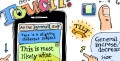
It has been the ambition of the Internet to make any knowledge available to anybody. To the puritan any design that make any demands, will be noise. But you may as well take the opposite stand, that the purely textbased information is reserved for the skillede readers. A wall-to-wall text web page is hard to read on screen. You’ll probably push the print button and get text pages that are just as illegible anyway.
By using the web features, that is frames, scripts, stylesheets etc., you can build web pages that are easy to read, nice to watch and at the same time (and maybe because of that) gives you no reason to print. And the internet will offer paperless communication for real.