Seven clicks towards Mobile First
10. okt 2011 The net is flooded with apps - for smartphones and tablets. But web sites are still better viewed on a computer, right? So the marketing department is happy and web design is business as usual. Maybe because apps and web sites are considered as two different things, rather than two versions of the same.
You may create coherence in web strategy by looking at app and website as the same project – in different versions, admittedly - with adapted features and design. And the task of doing this becomes easier if you design for the small mobile phones first.
I wrote the following is seven notes at the Mobilism konfererencen in Amsterdam in May. Notes that appropriately is made public now that ticket sales for Mobilism 2012 is close to starting.
11




According to Luke Wroblewski has the number of mobile devices exceeded the number of people in the world. In US is 20% said to be mobile only. And it doesn't seem to stop.
Thus, future development for website and internet applications should focus on the mobile: Mobile first, or at least at the same time.
Statistic predictions about mobile market mostly come through long before expected. Even though there is more internet traffic from the computer, there are now more mobile devices connected to the internet than pc's.
The possibilities in the web based applications for mobiles may be much underrated, especially by the marketing departments. Yet the discussion about web vs native apps is still going on, and not likely to be set. And according to Peter-Paul Koch {PPK}: To the question about which to choose the answer may well be: that depends…
Few of the arguments for web based:
The native has on the other hand, among other:
- Multiple platforms.
- Instant update.
- “No playing in anybody else’s backyard.”
The native has on the other hand, among other:
- Access to a marketsplace where you can sell your product.
- Access to the hardware of the device, such as camera.
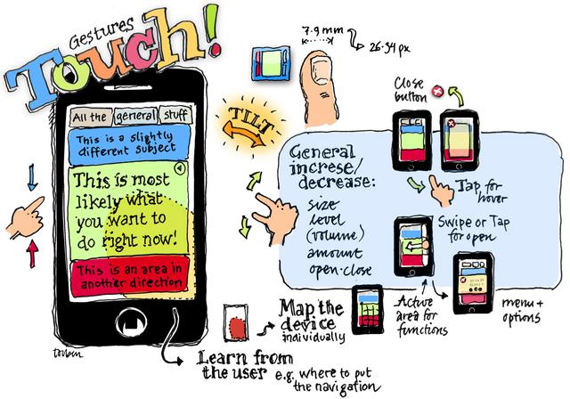
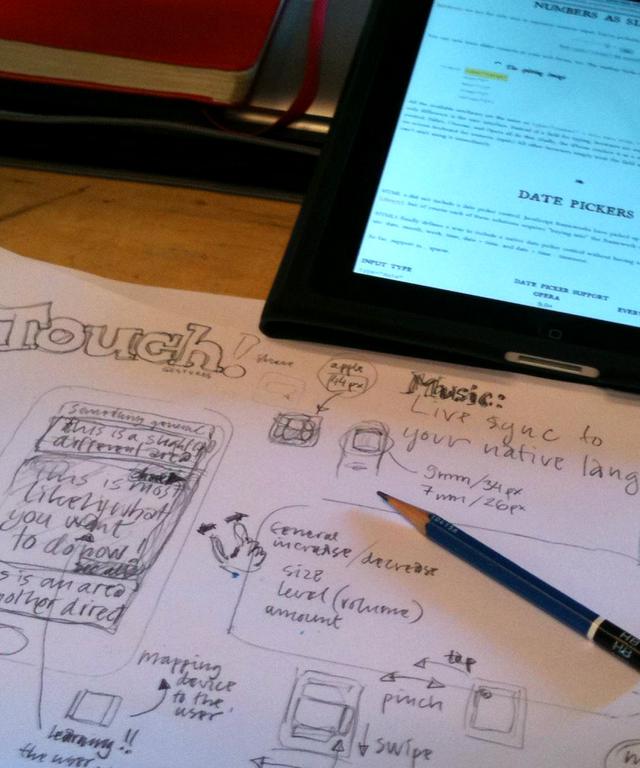
The small screen is obviously a severe restriction. But is also the one that helps you to focus the application on the most valuable. And it invites you to offer a simple and clean navigation to the next in line.
The question is then: If you may show 3 to 5 items on the page, which do you choose?
Example: The comfort zone of the mobile phone is in the bottom right area. So it seems appealing to put access for most used function there. But then again: Left handed will find the bottom left area more comfortable. The application should learn that and change the position of the functions accordingly for this each user.
Consequently: You don't don't want a strict design, rather than that kind of design ... that acts different depending on the user's behavior.
The web is created and has crown in our own image. And way past the childhood, the web has begun to suffer from the common lifestyle problems, such as obesity.
Ever faster computers and network have put the thrift of the 90es behind, and we have become increasingly careless about the kilobytes – as with the intake of large amounts of surplus data.
But if your app should fit into the coming new sleek collections, a diet is needed.
Size matters, again.
Portrait or landscape, iPhone, iPad, Galaxy, Android, netbook, air, or larger screen – name your own favorites. The number of combination of screen sizes … well, it is simply not possible to design a version of your web application for any brand, size and model. There ain’t enough designers, and we couldn't afford it. We need to automate the design process by setting up rules for laying out the content, at let the computer adapt the design to various screen conditions. The important words are flexible, adaptive and responsive.
And one of the major tools is css @media.

The day 1 workshop at the Mobilism conference took place on the top floor of Felix Meritis, Amsterdam.










![Spis Bare [Just Eat] receives Bording Prisen 2009](https://data.wil.dk/_images/_base/2009/200/spisbare_covers.jpg)

