Typography
2006-12-13
2
Type and typography. It's typedesign and articles about type.

Typo-offended ➜
»Do You by any chance remember: In which font did you scream?«More web sites for the danish authorities are using webfonts ➜
5. DEC 2013 //
But far the most of them still don’t! Only 22 out of 122 web sites for the danish authorities. And the majority of those are prefering free fonts. On the other hand is the number more than doubled in a year, since November 2012 when the number was 9 out of 115.The study is a snapshot that I took November 6, 2013 and covers the […]

3D enlightening Copenhagen ➜
20. JAN 2011 //
berlin
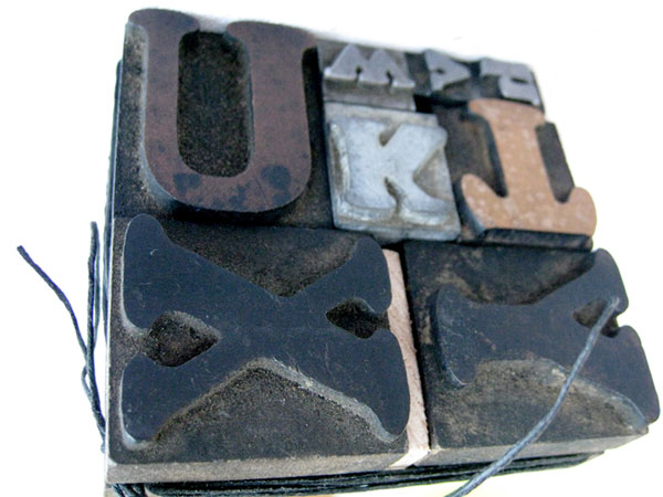
After visiting Buchstabenmuseum in the fall 2010, I started to register this applied typography in big scale in Copenhagen. Big letters, neon, and stuff.As far as I remembered, this was different from how it was back in Copenhagen. Consequently I started to look around here, and of course there were many more than I expected. […]
Fingerpainted fontdesign ➜
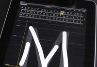
Take a few hours with iFontMaker on the iPad and tap, tap, draw, drag, pinch through the alphabet. And you may end up with a truetype font that you can write with on any computer, whenever the font is installed.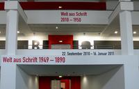
Welt aus Schrift, type exhibition in Berlin ➜
Posters, books, jugend, bauhaus and de stijl ... via swiss to decon. The Welt Aus Schrift exhibition in Berlin is beauty in the literal sense of the letter. Do take a visit!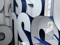
Big Letters Light ➜
Buchstabenmuseum Berlin. Why are these letters so attractive? I don't get an answer at Buchstabenmuseum, but I most certainly get a wish to look after all these servants of the announcements, sofisticated as well as monumental.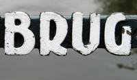
Bridges and letters in Amsterdam ➜
Round the city of Amsterdam, crossing the grachten - many of the bridges have their names displayed with ‘De Amsterdamse Brugletters’.Typesetting the net - font embedding ➜
For a very low cost of 5-10 k fontembedding gives the possibility of getting typographic identity for a whole website – allthough with a litte trouble.The frustration about missing typographic tools for web design might be well aknowledged. How do I make typography in a graphically sense for the web. Cascading stylesheets offers […]
TypoMov ➜
The spoken information on the other hand is dynamic with an absolute demand of presence. If you're not there, you'll miss it, because the spoken word disappears instantly. The meaning of the spoken information may be stored in your memory, but the words are gone.TypoMov is a brief presentation of the main points of a lecture […]
![Fontc[art] Generator](https://data.wil.dk/_images/_base/2009/200/theskrift_lowcrop.jpg)
Fontc[art] Generator ➜
Everything that can’t be automated is design.At the ATypI conference in Copenhagen 2001 Erik van Blokland, Letterror, made the statement that design is not to make one or more possible solutions of a certain task. Design is rather choosing the right one among all these possibilities. And since the making of the examples […]
