Don’t buy a train ticket with this app
2011-07-25 Unfinished, ill-considered apps or apps that serve the market better than the use off it. If Apple has a sometimes paranoid restrictive approach to the formalities regarding an app you want to get into the App Store, they may have a comparable little interest in that the app works well. Fortunately, one could say, that should be the developer's task. But not everyone can not live up to this task, which also counts for DSB and the DSB Ticket app.
4
We have (always) had this dogma in the web industry that a website never is finished. We are constantly facing new things in the world, new needs, new opportunities, so a website is per definition always under development. Or it should be, which is not always the case, but that’s quite another story.
The dogma is often twisted: There will always be errors, we can not get around every corner, we can not complete it anyway. In the worst cases it’s translated into that you don’t have to exert yourselves, and therefore may users, in ordinary everyday situations, meet inadequate and faulty applications.
Unfortunately, this dogma has also infected app industry, which probably largely made up by the same people as the web industry, which explains the infection. But unlike a website, you can not just send out an update when the walls start coming down. Maybe the problems are not even surprising for those who develop the app - I have this hunch that the marketing department or finance department have had more influence on the release and deadlines than development department had.
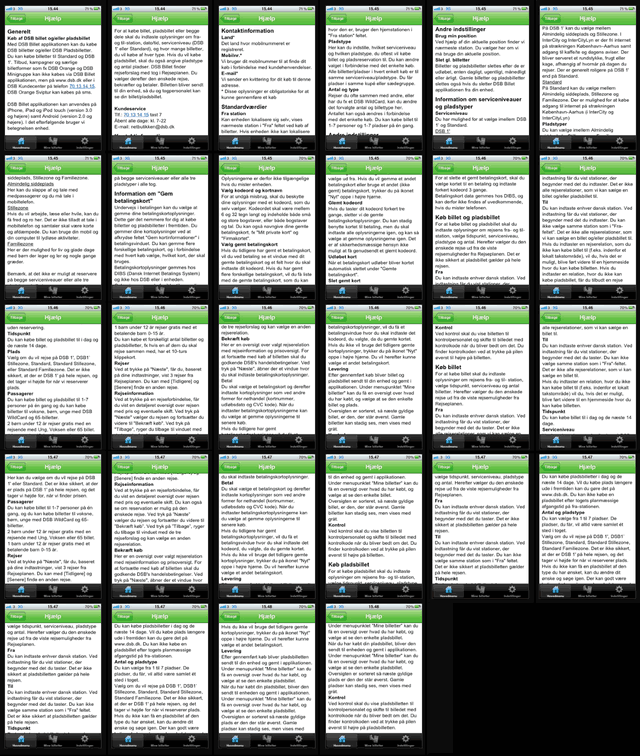
DSB Ticket (from Danish Railways) falls in this category. It is marketed as the ticket office on your smartphone, which (off course) is an exaggeration. There are no special deals, no cheap tickes, no help for alternatives. And to learn this you must scroll through the 28-pages (!) all text based help. Enthusiasm is artificial, just as when you in the S-train hear oddities such as “The train doesn’t go any further – on time!”
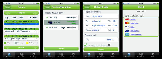
Actually, the hype is annoying, because the app actually works by the simple model: I can find a train, I can buy a ticket and (or only) a place, pay by credit card. And, voila, I have a ticket on the phone. Even a ticket that looks like one the ticket inspector can read and control (as opposed to the SMS tickets that in practice can not be read or decoded in the time devoted to checking the ticket).
So the app works – if you do not make any detours. Then the trouble begins.
When you select the type of compartment and it proves to be unavailable, no other options are offered automatically. You must click back and make another selection and check if that might be possible. If that also is not available, you must back again, and so forth.
But the worst is the payment page. There is no overview of the current purchase, there is no back button, and no cancel button. Actually, I’m locked to the page, if I don’t just pay. I have to switch the phone off completely to quit. This is so absurd that it wouldn’t take many user tests to detect.
And we are back at the start: Why do you publish a half-finished app? Why run the risk of angry users, and having them wait for weeks, not just on debugging, but also to get updates through the approval process. It is tempting to blame the App Store and Apple's business model, although it al comes down to not doing the job properly in the first place. Maybe you do this, not because of the app, rather than the oportunity to tell about it. I’d be poor to be rich in such stories.
Yes, you may buy a train ticket ... but the track can be bumpy.
Once you’ve found the train and decided the compartment, all is fine until you come to the payment. If you have any doubts at this point, you’re trapped. Pay the ticket or the penguin on your television will explode!


Help! ... 28 screens, all text ... I wouldn’t think of that as a very helpful feature.


