I was pleased at ‘Total Typographic Saturday’ in the end of october, as Tore Rosbo and Clea Simonsen from the design bureau 1508 presented the identity for Århus University.
I had seen it before, the new identity, in real life, and thought: Hey, ther’s something there ... Bauhaus typography, a typographic grachic solution. It worked, but there was something else as well.
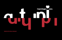
And that something revealed itself, there in the middle of saturday afternoon: A logo generator, yes!
I have often discussed this with Henrik Birkvig on our typographic journeys through the years: the logo as a function – apart from form and obvious identity. And we often agree, if anyone is doubt:
The logo is not an element - a graphical form, rather than the character in the way it is exposed in various contexts. Thus, the logo is not any more a categorism, but a organism, a being.
And a logo generator is a way to take the logo in that direction. The logo may in real be created in any context. Which in this case is various text, but might as well be colors, textures, even time and temper ... maybe not only the fantasy should limit the possibilities, but they are many.
This is not a logo
2009-12-02 The logo is not an element, a graphical form, but the character in the way it is exposed in various contexts. Thus, the logo is not a categorism any more, but a organism, a being.
6
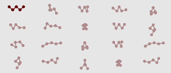

 At each page load the dots are distributes random within the five defined areas. And connected of course.
One is chosen (no, not at random) but by some kind of intuition.
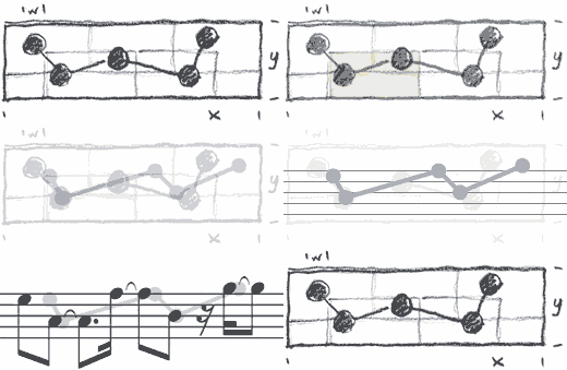
The dots are distributed over time as notes and composed as a simple logo sound bit:
It was the same approach I had when I designed my log on this web site. Previously the logo was just a 'W' - animated though, in a simpel gif animation, as it appeared on the web. On papir it was still just the W. But a logo should not be static – nor just visual, but that’s a different issue. So I had already taken action accordingly: redesign the logo!

First of all, the logo were not to me animated - I find the animated gifs a bit altmodisch nowadays. On the other hand needed the logo a touch of randomness. So I redefines the old fixed (on paper) W to a variable W, sometimes not even the W, but just the five connected dots.
In this way the logo becomes a timedepending perception. The result form is then the pattern that is caught only if you've seen several different occurances.

 At each page load the dots are distributes random within the five defined areas. And connected of course.
One is chosen (no, not at random) but by some kind of intuition.
The dots are distributed over time as notes and composed as a simple logo sound bit:
It’s pretty simple the score in a simple version og the logo sound. If there’s something in it that triggers, a rythm, a tone beneath, you may go a bit further: what if we put a little more sound into it...:
Okay then, a little bit animation on the logo anyway.




![Spis Bare [Just Eat] receives Bording Prisen 2009](https://data.wil.dk/_images/_base/2009/200/spisbare_covers.jpg)
![Fontc[art] Generator](https://data.wil.dk/_images/_base/2009/200/theskrift_lowcrop.jpg)
