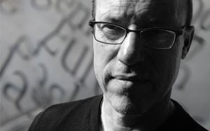
uf Feet
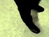
1996-11-18 Originally this was 8 variations of the theme: the foot position when standing and waiting. Through overdubbing 28 stances were made, and many different dances can be written.
This a part of the typo-mov (a mobile type project, 1996, only partly available now).
It used to be 8 footsteps, each representing a letter.
Later they were overdubbed to new steps in order to make 28 letters of an alphabet.
Upper case letters are variable backgrounds and lower case letters hold the different steps.
You can make patterns with the textfont and make new dances with the mobile type in ufFeetMovie (updated March, 2021)
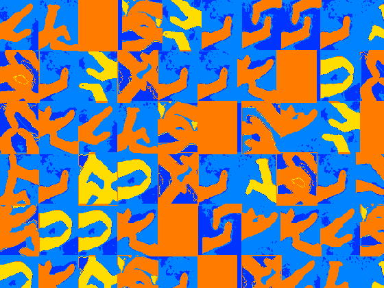
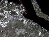
Feet as colored layers
3
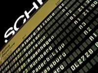
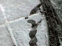
… and wait for the runway to be cleaned up for snow. Berlin Templehof, november 1995.
 |  |  |
 |  |  |
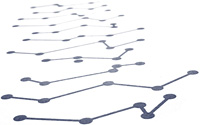
 Letter A Letter A | 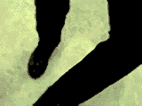 Letter B Letter B |  Letter E Letter E |  Letter I Letter I |
 Letter N Letter N |  Letter O Letter O | 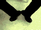 Letter U Letter U | 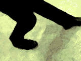 Letter Y Letter Y |
This is not a logo ➜
The logo is not an element, a graphical form, but the character in the way it is exposed in various contexts. Thus, the logo is not a categorism any more, but a organism, a being.I was pleased at ‘Total Typographic Saturday’ in the end of october, as Tore Rosbo and Clea Simonsen from the design bureau 1508 presented the identity […]
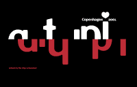
ATypI Copenhagen logo ➜
We had the napkin with the notes from the galla dinner at ATypI in Leipzig 2000, Henrik Birkvig and I on the flight back to Copenhagen, and we knew that we, together with Kim Pedersen, were about to organize ATypI in Copenhagen the year after. And already then we sketched the cliches for identity of the conference: Red-white, old-new […]Typo-offended ➜
»Do You by any chance remember: In which font did you scream?«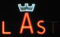
3D enlightening Copenhagen ➜
20. JAN 2011 //
berlin
After visiting Buchstabenmuseum in the fall 2010, I started to register this applied typography in big scale in Copenhagen. Big letters, neon, and stuff.As far as I remembered, this was different from how it was back in Copenhagen. Consequently I started to look around here, and of course there were many more than I expected. […]
Fingerpainted fontdesign ➜
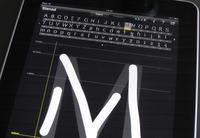
Take a few hours with iFontMaker on the iPad and tap, tap, draw, drag, pinch through the alphabet. And you may end up with a truetype font that you can write with on any computer, whenever the font is installed.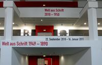
Welt aus Schrift, type exhibition in Berlin ➜
Posters, books, jugend, bauhaus and de stijl ... via swiss to decon. The Welt Aus Schrift exhibition in Berlin is beauty in the literal sense of the letter. Do take a visit!
Big Letters Light ➜
Buchstabenmuseum Berlin. Why are these letters so attractive? I don't get an answer at Buchstabenmuseum, but I most certainly get a wish to look after all these servants of the announcements, sofisticated as well as monumental.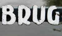
Bridges and letters in Amsterdam ➜
Round the city of Amsterdam, crossing the grachten - many of the bridges have their names displayed with ‘De Amsterdamse Brugletters’.![Fontc[art] Generator](https://data.wil.dk/_images/_base/2009/200/theskrift_lowcrop.jpg)
Fontc[art] Generator ➜
Everything that can’t be automated is design.At the ATypI conference in Copenhagen 2001 Erik van Blokland, Letterror, made the statement that design is not to make one or more possible solutions of a certain task. Design is rather choosing the right one among all these possibilities. And since the making of the examples […]