The blue trompet

And where did the light come from, so filled with life. The trumpet had regained some of its lustre, as if the dust had melted away, but little by little he stopped wondering.

Den Blå Trompet [ The Blue Trumpet ] is my design studio – and the title of a short story written back in the 1980’s when the ravages of time were kill or cure.
9
5

Kinds of blue

Blue keeps popping up

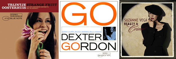
Blue Notes Records

Some pieces from the record company.

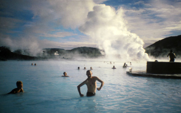
Blue Lagoon, Iceland

Henrik Birkvig, Helle Rindom and I took, as did many others, a detour to the blue lagoon at Keflavik ... we were on our way to ATypI konference in Boston in 1999.
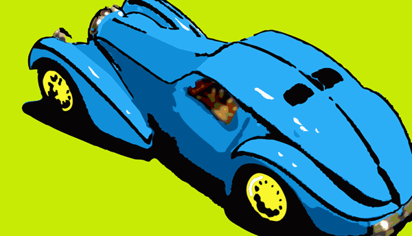
Blue car

The blue car is absolute my car, my model that is.
'Den Blå Bil' is also a comic strip studio that worked from the 1980's until 2003. Which I didn't any connection with, except a share interest in comics I felt like mentioning them.
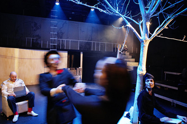
The Blue Hotel

I've mentioned this somewhere else: The Blue Hotel is a music theatre created by Michael Vesterskov and Marianne Mortensen. It played at The Jomfru Ane Theatre in Aalborg in may 2009. More about the piece (in danish, sorry)
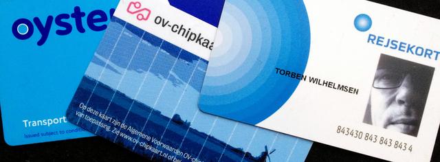
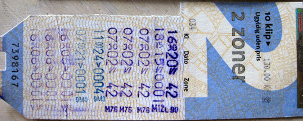
Blue zone card (Copenhagen, Århus and Aalborg in Denmark)

The blue zone card is the cheapest zone card in Copenhagen: 2 zones, 10 stamps 130 ddk.
In Århus the cheapest is yellow, and the price is as follows lower: 115 ddk for 10 stamps. On the other hand the buses are (light)blue.
In Aalborg the cheapest card is orange: 116 ddk. They have a blue card allright, but it covers 4 zones and costs 232 ddk. You have to go pretty far outside Aalborg to need 4 zones.
The danish zone cards are, after years delay, finally being replaced by the Rejsekort – about 8 years later than the similar ov-chipkaart was introduced in The Netherland, and 10 years after oyster came to London.
Basically the Rejsekort works, but we are not best friends. The delay makes it seem as ancient technology right from the start. And in some ways it is less convenient than its predecessor.
At least the Rejsekort is blue.

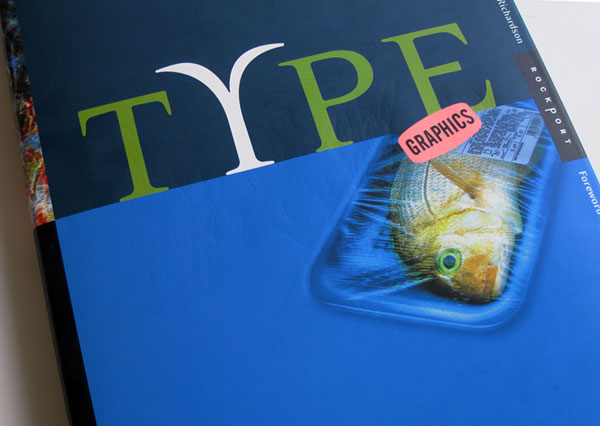
Type Graphics

Not really blue, apart from the cover. But it’s an opportunity to tell that I was represented with some pages in the book Type Graphics by Margaret E. Richardson, published in 2000.
This is not a logo

This is not a logo

The logo is not an element, a graphical form, but the character in the way it is exposed in various contexts. Thus, the logo is not a categorism any more, but a organism, a being.
I was pleased at ‘Total Typographic Saturday’ in the end of october, as Tore Rosbo and Clea Simonsen from the design bureau 1508 presented the identity […]
Catch me

Catch me

7. JUN 2014 // cd-cover
‘Grib mig’ is the title in danish, for the time being, of a coming cd, for which Marianne Mortensen and Michael Vesterskov had gathered four musicians for two days live recordings. I had the pleasure of being among the audience – and to design the provisional cover that together with a sign up form should make the audience pre-order […]
Egg pattern

Egg pattern

14. APR 2014 // design
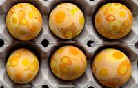
Pattern with eggs for the tablecloth and the napkins for the easter celebration lunch. Enjoy.
iSticks and iSkins

iSticks and iSkins

13. DEC 2010 // ipad /mobilt web /offentligt rum
The danish boulevard newspaper, Ekstra Bladet, has decided to campaign for the freedom of speech – seen as the freedom of nudity. The danish MEP, Morten Messerschmidt is supporting by taking the discussion into the European Parliament.
Seven clicks towards Mobile First

Seven clicks towards Mobile First

The net is flooded with apps - for smartphones and tablets. But web sites are still better viewed on a computer, right? So the marketing department is happy and web design is business as usual. Maybe because apps and web sites are considered as two different things, rather than two versions of the same.
You may create coherence […]
Welt aus Schrift, type exhibition in Berlin

Welt aus Schrift, type exhibition in Berlin

12. NOV 2010 // design /typografi /berlin
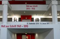
Posters, books, jugend, bauhaus and de stijl ... via swiss to decon. The Welt Aus Schrift exhibition in Berlin is beauty in the literal sense of the letter. Do take a visit!
Bridges and letters in Amsterdam

Bridges and letters in Amsterdam

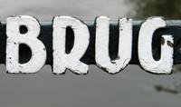
Round the city of Amsterdam, crossing the grachten - many of the bridges have their names displayed with ‘De Amsterdamse Brugletters’.

The photography is dead – long live the photographer

10. JUN 1998 // design /illustration
First the good news: The photography has lost its trustworthyness, because the digital technology has made it obvious to anybody that every photopgraphy can be manipulated.
And then the bad news: We are being told that actually the possibility of computer manipulation it self killed the reliability. And thus tend to maintain […]
Spis Bare [Just Eat] receives Bording Prisen 2009

Spis Bare [Just Eat] receives Bording Prisen 2009

15. JUN 2009 // design /tidsskrift /spis bare
The danish magazine Spis Bare is a very inspirering food-professional og well-informed magazine med professional depth and delicious presentation.
Friday June 12 the magazine Spis Bare was awarded Anders Bordings Mediepris 2009. I have in collaboration with the editor, Mette Jensen, developed the magazine during the last […]

The user rules

1. MAJ 2000 // design /web
Usability and accessibilty on the web becomes synonymous with free choice and professionalizing of the user. Thus, she is more and less self responsible for being able to recieve the information of the websites.
The computer is putting still greater demands to the user, but despite of that it is easier to use today than ever. […]
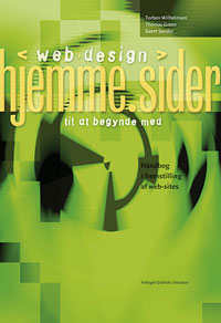
Web design, home pages for starters

Web design, home pages for starters

1. SEP 2001 // design /web
To the puritan any design that make any demands, will be noise. But you may as well take the opposite stand, that the purely textbased information is reserved for the skillede readers.
Torben Wilhelmsen, Thomas Green and Geert Sander Published first time in 1997. The book was one the selected Books of the Year in 1998 in Denmark. […]
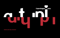
ATypI Copenhagen dynamisk logo

ATypI Copenhagen logo

We had the napkin with the notes from the galla dinner at ATypI in Leipzig 2000, Henrik Birkvig and I on the flight back to Copenhagen, and we knew that we, together with Kim Pedersen, were about to organize ATypI in Copenhagen the year after. And already then we sketched the cliches for identity of the conference: Red-white, old-new […]

More web sites for the danish authorities are using webfonts

5. DEC 2013 //
But far the most of them still don’t! Only 22 out of 122 web sites for the danish authorities. And the majority of those are prefering free fonts. On the other hand is the number more than doubled in a year, since November 2012 when the number was 9 out of 115.
The study is a snapshot that I took November 6, 2013 and covers the […]
It looks like a mail from the agriculture association, but it might as well be phishing

It looks like a mail from the agriculture association, but it might as well be phishing

If I buy something on, say, sales.com, the response mail should come from sales.com and all links within the mail should be to sales.com. Anything else looks as a phishing attempt, and it might as well be.

Technical enthusiasm, please

1. SEP 2000 // web
Usability and accessibility on the net becomes more and more equal to unlimited choices and professionalizing of the user, who thus will be the responsible to be able to get the information from the websites.
You may say I am puritan. On the other hand, when I shuffle the web, I may too say that I have the right to be puritan. […]
Your website is (almost) an app

Your website is (almost) an app

14. DEC 2010 // reklame /ipad /web /mobilt web /mobilism /web apps
I must admit, it’s (still) cool to have my icon right there on the iPad screen. As an app, yes, but a website can also do the trick. And website based app may sometimes even be a better solution than a native app.

Typesetting the net - font embedding

23. SEP 2000 // typografi /web
For a very low cost of 5-10 k fontembedding gives the possibility of getting typographic identity for a whole website – allthough with a litte trouble.
The frustration about missing typographic tools for web design might be well aknowledged. How do I make typography in a graphically sense for the web. Cascading stylesheets offers […]

Freedom through constraint

10. OKT 2001 // web
The postman is somewhat special. He brings all sorts of things. Postcards from Jamaica. Bills, too, unfortunately, but it’s not his fault, after all.
home.pages - preface - june 1997 The postman is somewhat special. He brings all sorts of things. Postcards from Jamaica. Bills, too, unfortunately, but it’s not his fault, […]